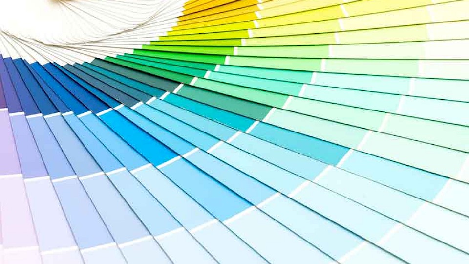
2021 Pantone colours of the year


Last year the Pantone colour Institute had chosen ‘Classic Blue’ as the colour of the year. Laurie Pressman, the vice president of the Pantone colour Institute, said about ‘Classic Blue’: “It’s a colour that anticipates what’s going to happen next.” And, she wasn’t wrong with what happened next - no one could predict it!
At the end of last year on 9th December 2020, Pantone announced its 2021 colours of the year as ‘Ultimate Grey’ and ‘Illuminating’. These shades were said to be chosen for their warmth and dependability due to a year in which ‘we wrestled with illness, a global pandemic and economic distress’. This coincides with the unusual aspect of two colours being chosen, denoting that the colours have been given serious thought this year.
The two Patone colours were announced and described both colours as ‘Illuminating’: “A bright and cheerful yellow sparkling with vivacity, a warming yellow shade imbued with solar power.” Whereas, the colour ‘Ultimate Grey’, was described as: “Pebbles; solid and dependable elements which are everlasting and provide a firm foundation.”
The ability to forecast colour trends is a marketing force that helps furniture, fashion and technology designers to choose the best designs for each season. Pantone has a huge influence on the way retailers, designers and fashion brands work, as they will flood our browsers, advertisements and our inboxes with grey and yellow items, encouraging us to buy them.
“The selection of two independent colours highlight how different elements come together to express a message of strength and hopefulness, that is both enduring and uplifting, conveying the idea that it’s not about one colour or one person, it’s about more than one. The union of an enduring ‘Ultimate Grey’ with the vibrant yellow, ‘Illuminating’, expresses a message of positivity supported by fortitude,” said Leatrice Eiseman, executive director of the Pantone Colour Institute, in a recent press release.
For over 20 years, Pantone’s ‘Colour of the Year’ has heavily influenced colourways in things like product development and purchasing decisions in various widespread industries, including graphic design and home furnishings.
Pantone Colour Institute highlights the top seasonal colours which, therefore, forecasts global colour trends and advises companies on their brand visuals and identities. Pantone does this through seasonal trend forecasts, colour psychology, and colour consulting, in addition to using global brands in order to leverage their power and design strategy. The selection process requires thoughtful consideration and in-depth, vigorous trend analysis. Pantone colour experts search the world looking for new colour influences and trends every single year. In relation to what is happening in the world, this year and last, we can only hope that this year’s forecast of ‘hope and stability’ is more than just a colour or educated guess but, is an insight into the future and what is coming in 2021.
If there are any other specialist finishing or colours that you would like us to include in your request, do not hesitate to ask. We can offer bespoke laminating, perforating, dye cutting and much more. Prices will be quoted upon an enquiry. Lanes Printers, has been established in East Kent as a quality printing house for more than a hundred years and are always here to help and to trust with your printing. Why not get in touch with our friendly team today? Alternatively, you can give us a call on 01843 861314 to discuss your requirements.
Lanes Printers © 2026